The data tables full of numbers can be boring and you can give it an interesting spin using the built-in features of Excel. This post will show you the best tips to format tables data in Microsoft Excel. We are using a Mac and the same steps apply to Windows users.
1. Sparklines
Let’s say you are creating a table that includes data like monthly sales or daily weight loss progress. Sparklines is a feature of Microsoft Excel that allows you to create a mini graph inside a cell. This will help you to visualize the data in a better way. Follow these steps. Step 1: Open Microsoft Excel on your computer. Step 2: Open a spreadsheet file you want to edit. Step 3: Select the fields whose data points you want to visualize.
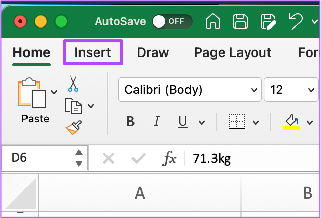
Step 4: Click on Insert at the top menu bar.
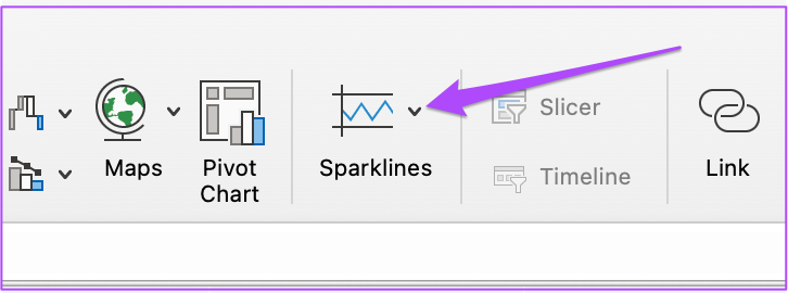
Step 5: Look for the Sparklines option towards the top right.
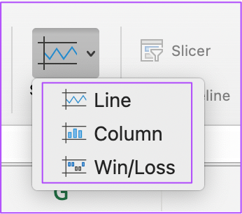
Step 6: Click the option and select your graph style.
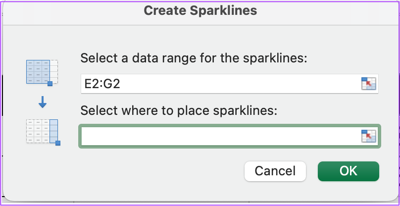
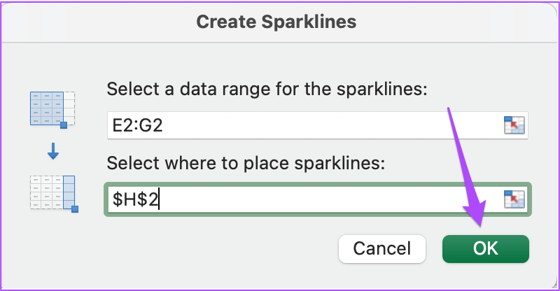
The Sparklines window will open up and ask you to select the cell for placing the sparklines.
Step 7: After selecting the cell, click the Ok button.
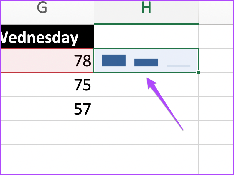
Excel will create a mini graphy inside the selected cell. You can repeat the steps and create Sparklines for every cell of your choice.
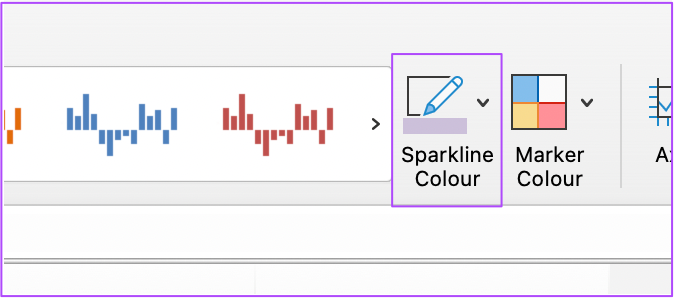
You can also change the Sparklines color by clicking the option in the top menu bar towards the right.
2. People Graph
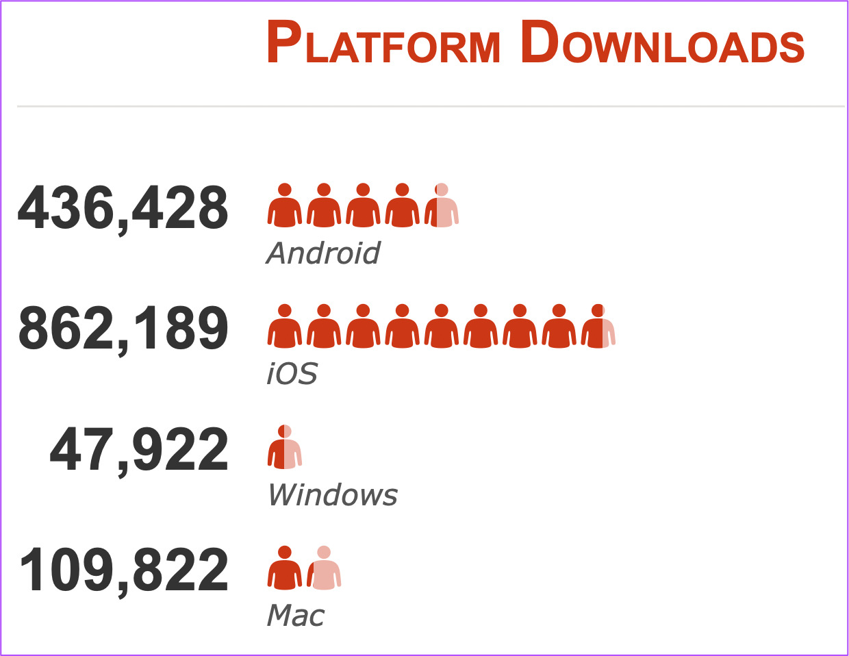
If you create reports with data points like app downloads, social media engagement, newsletter subscribers, and more, People Graph will a handy feature for you to represent your data in a visual manner. It will make your spreadsheet more lively and make the tracking metrics more related to humans. Follow these steps. Step 1: Open Microsoft Excel and select your spreadsheet file. Step 2: Click on Insert in the top menu bar.
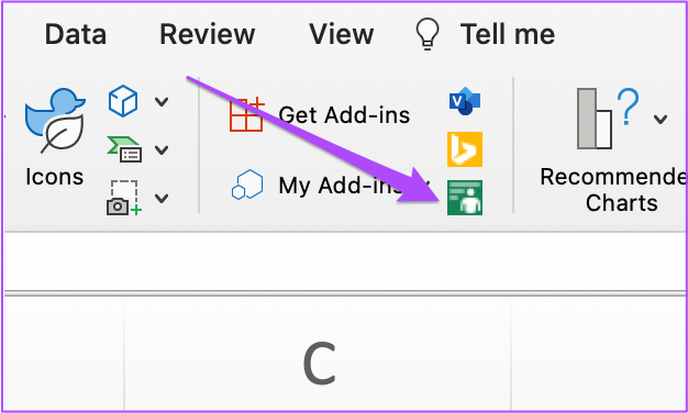
Step 3: Click the green icon next to ‘My Add-ins’ to add a People Graph.
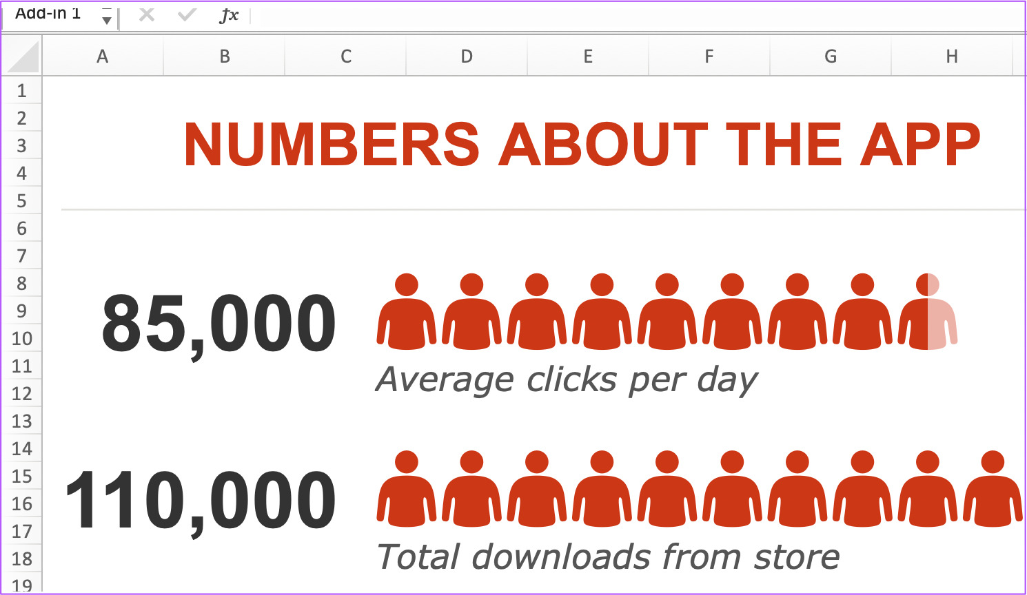
A default People Graph will appear in your sheet on the top of your table.
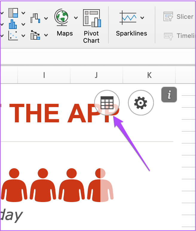
Step 4: Click and drag to move the People Graph away from the table. Step 5: Select the People Graph image and click the Data icon at the top right.
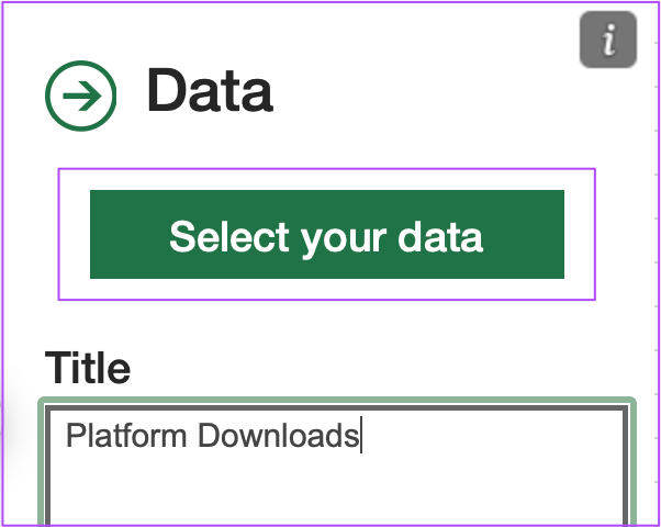
Step 6: Change the title of your People Graph to match it with your table.
Step 7: Click on Select Your Data.
Step 8: Select the data points from your table that you want to add to the People Graph. Step 9: Click on Create.
You will see a new People Graph in your sheet that represents the metrics of your table.
To change the icon type, theme and shape, simply click the Settings icon at the top-right corner of the People Graph.
3. Slicer
Sometimes while analyzing the data in a table, the presentation of the metrics can get overwhelming. There is a chance that you might get confused or lost while studying the numbers placed under various categories. You can avoid all the hassle by using the Slicer tool. It is a great option for filtering your data in small, digestible tables. Here’s how. Step 1: Open your spreadsheet in Microsoft Excel. Step 2: Press Command+A (Mac) or Control + A (Windows) to select your table. Step 3: Click on Insert in the top menu bar while keeping the table selected.
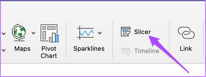
Step 4: Select Slicer from the top menu bar towards the right.
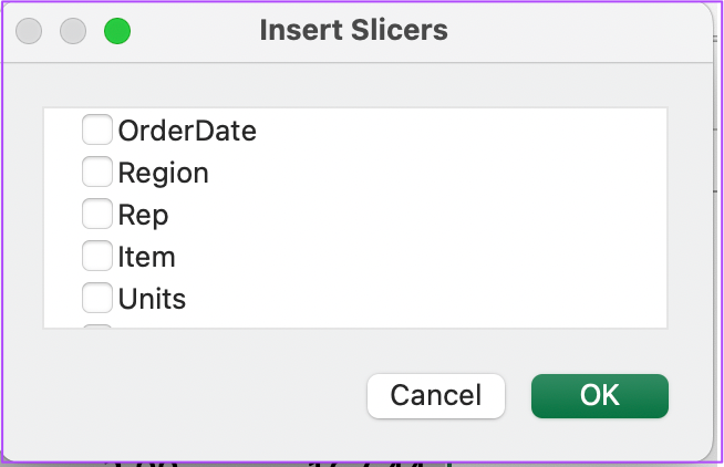
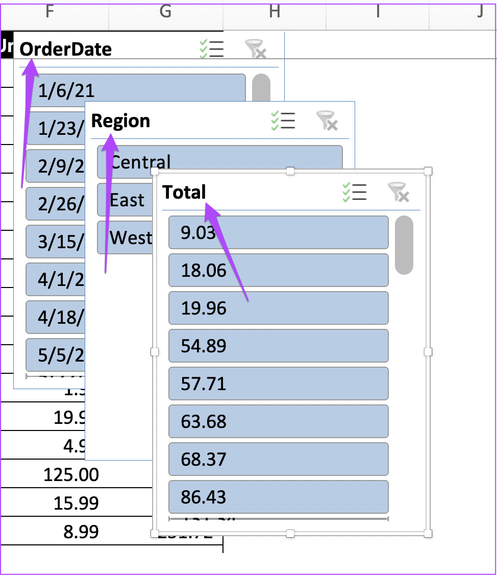
Step 5: In the Slicer window, select the categories of your data to insert Slicers for the same.
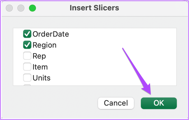
Step 6: Click on Ok to confirm your selection.
The Slicers for your selected data categories will appear in your spreadsheet.
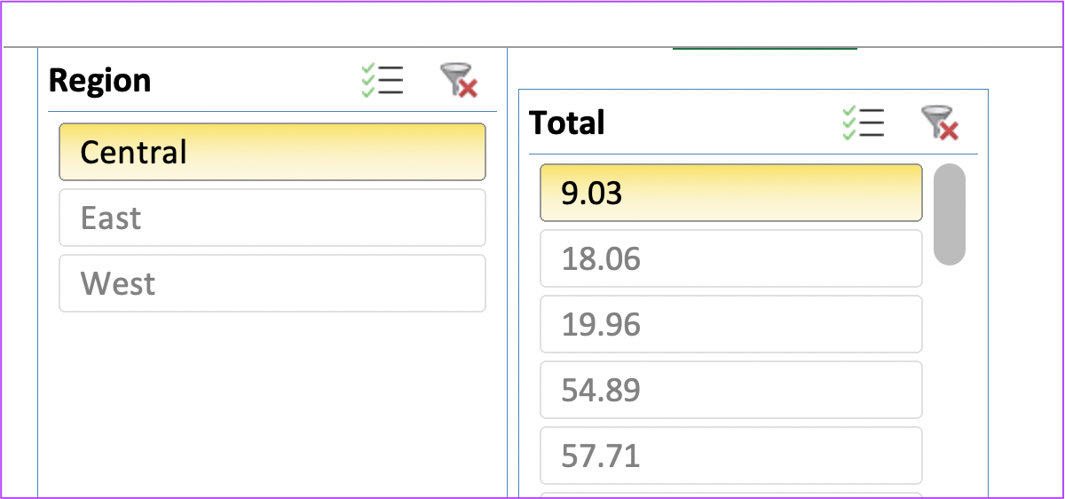
You can now select individual data filters from your table to view the metrics separately.
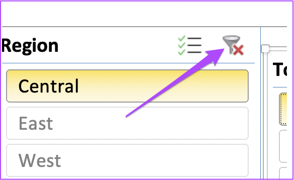
To deselect your filters, simply click the Clear Filter icon at the top right.
4. Format Paint
Format Paint lets you maintain the consistency of your table format while adding different tables in the same spreadsheet. If you want to use this feature in your spreadsheet files, follow these steps. Step 1: Open your spreadsheet file in Microsoft Excel. Step 2: Select the cells of the table whose format you want to copy. Step 3: Click on the Paintbrush icon at the top-left corner under the Home tab.
Step 4: Bring your cursor to the non-formatted table and select all the cells. You will see that both the tables now have the same format consistency.
5. Consolidate Data
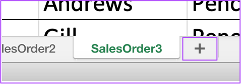
If your spreadsheet file contains more than 1 sheet tab, you can compile all the data from the sheets into a single tab with this feature. The best part is that you don’t need to insert any specific formulas! You can use sum, average, count, and more in the source tabs and the consolidated tab will update automatically. Follow these steps. Step 1: Open your spreadsheet file that contains more than 1 sheet tab. Step 2: Click the Plus icon at the bottom to create a new sheet tab and name it as per your preference.
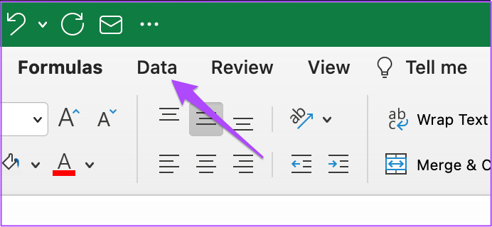
Step 3: In the new sheet tab, select the cell from where you want to place the consolidated data. Step 4: Click on the Data tab in the top menu.
Step 5: Under the Data tab, select the Consolidate icon on the right side.
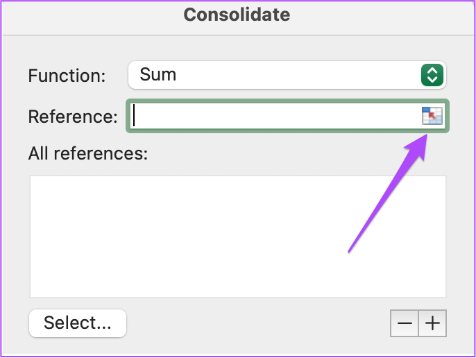
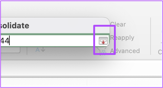
Step 6: In the Consolidate tab, click the Reference icon to add source data.
Step 7: Once the Consolidate tab contracts, open your first sheet tab and select all the data in it. Step 8: Click the Reference icon again to retract the window.
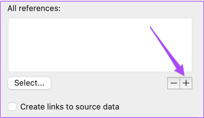
Step 9: Click the Plus icon again.
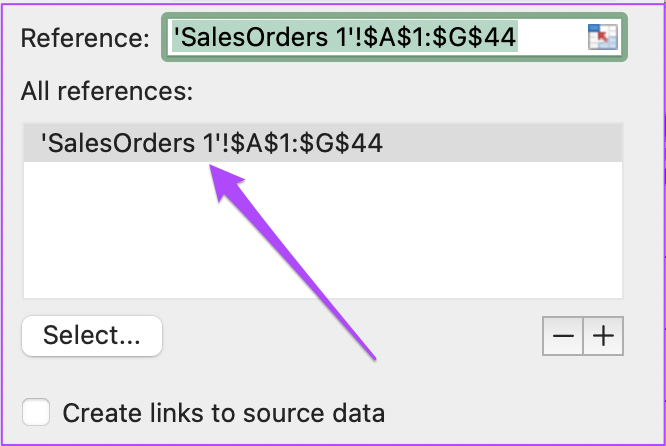
You will see the reference of your first sheet data getting added in the ‘All References’ box.
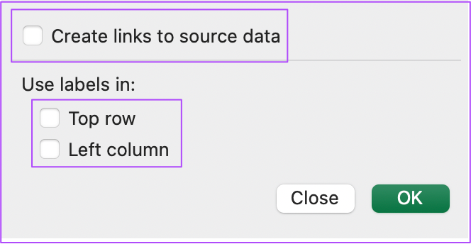
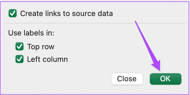
Step 10: Click the Reference icon again and repeat the steps to add reference sheet data in the Consolidate window. Step 11: After selecting your date, make sure that the option of ‘Create links to source data’ is checked. Do the same for the ‘Top Row’ and ‘Left Column’ options.
Step 12: After enabling all the options, click on Ok.
You will see a new table in the sheet tab with all the consolidated data from the previous sheets.
Format Tables in Microsoft Excel
Table formatting is the greatest asset of Microsoft Excel. The features mentioned in this post will improve your productivity and data presentation skills. Just make sure that you are using the latest version of Microsoft Excel on your desktop. The above article may contain affiliate links which help support Guiding Tech. However, it does not affect our editorial integrity. The content remains unbiased and authentic.







![]()
